Agencia 92: Your Source for Trending News
Stay updated with the latest insights and stories that matter.
Color Me Impressed: Choosing the Right Palette for Your Website
Unlock the secret to stunning websites! Discover how to choose the perfect color palette that captivates and converts!
5 Essential Tips for Selecting the Perfect Color Palette for Your Website
Choosing the right color palette for your website is crucial, as it can influence user experience and convey your brand’s personality. Here are 5 essential tips to guide you in selecting the perfect colors. First, consider your target audience. Understanding their preferences can help you choose colors that resonate well with them. For instance, vibrant colors may appeal to a younger demographic, while muted tones may instill a sense of professionalism for a corporate audience.
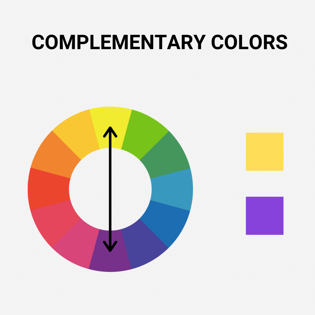
Second, use color theory to create harmony within your palette. Familiarize yourself with the basics of color wheel relationships, such as complementary, analogous, and triadic colors. Next, limit your palette to a few primary colors and their shades, as too many colors can create a chaotic look. Aim for a balance of contrast and consistency across your website to enhance readability. Additionally, test your choices on various devices to ensure they look good everywhere before finalizing your selections.

How Your Website's Color Palette Affects User Experience and Engagement
The color palette of your website plays a pivotal role in shaping the overall user experience and engagement levels. Colors can evoke emotions, convey brand identity, and guide users through the content. For instance, warm colors like red and orange tend to create a sense of urgency, making them ideal for call-to-action buttons. In contrast, cooler tones such as blue and green foster feelings of tranquility and trust. When selecting your website's color scheme, it's essential to consider how these colors affect user perception and their actions on your site, as this directly influences engagement rates.
Additionally, the right color palette can enhance readability and ensure that important elements stand out. Proper contrast between text and background colors makes content easier to digest, while a well-considered combination allows users to navigate your site more intuitively. If users struggle to read text due to poor color choices, they are likely to leave your site quickly, negatively impacting your user experience metrics. Therefore, investing time in carefully choosing a color scheme not only boosts aesthetic appeal but also plays a crucial role in retaining visitors and driving engagement on your platform.
What Are the Most Effective Color Combinations for Website Design?
Choosing the right color combinations for website design is crucial, as it can significantly impact user experience and engagement. A well-thought-out color palette can evoke emotions and influence visitor behavior. For instance, blue and orange create a vibrant contrast that is both attention-grabbing and visually appealing. On the other hand, a combination of green and beige promotes a calm and natural feel, ideal for eco-friendly brands. Here are a few effective combinations to consider:
- Blue and yellow
- Red and white
- Purple and gold
When selecting color combinations, it is essential to consider the psychological impact of colors. For example, the combination of black and white exudes sophistication and simplicity, making it a popular choice for luxury brands. Additionally, using warm colors like red and orange can stimulate appetite and excitement, which is why they are often used in food-related websites. Remember, the key to effective color combinations lies in creating a harmonious balance while aligning with your brand identity.